
Reactive Element Size Tracking in Angular with ResizeObserver and Signals
By Timo Spring
August 13, 2025 • 10min read
Modern web applications are increasingly embracing dynamic and flexible layouts. Thus, reactive UI updates not only have to respond to user input, but also to layout changes and viewport resizings.
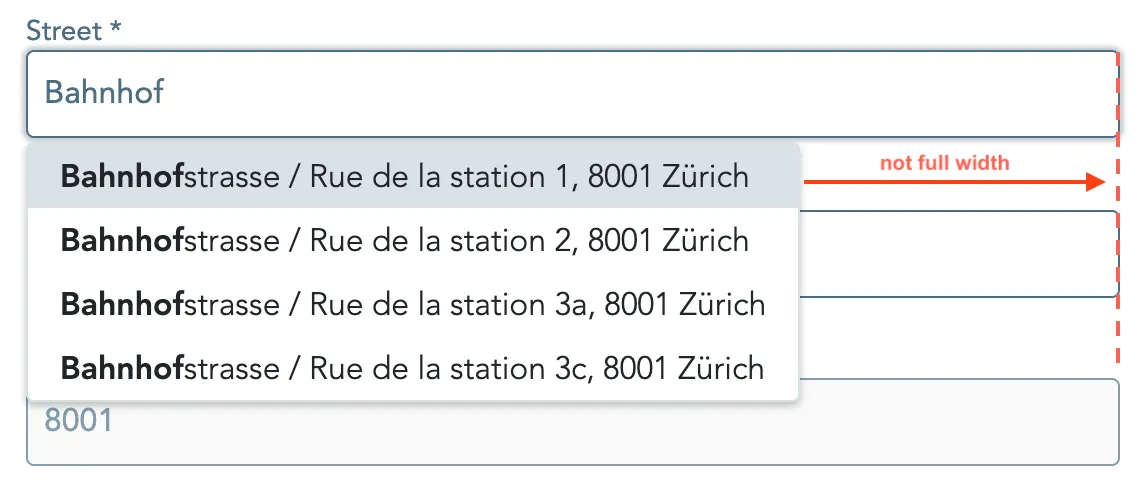
A frequent challenge is keeping dropdowns or overlays aligned with their trigger elements. Specifically for an autocomplete input, ensuring the width of the dropdown window matches the width of the corresponding input field.
In some cases, a pure CSS solution might suffice to tackle the issue e.g. using width: 100% or min-width: inherit.
However, this relies on the DOM structure and CSS inheritance, which doesn’t always guarantee that the dropdown will match the width of the input element.
Especially if the dropdown is rendered outside the normal flow of the DOM (e.g., in overlays, portals, or absolutely positioned containers).
Traditionally, developers relied on the global window:resize listeners and manual DOM manipulations to handle these cases.
With the introduction of Angular Signals and by leveraging modern Web APIs, we now have a cleaner, more reactive, and efficient alternative.
The Problem with Window Resize
One requirement is to ensure that the width of a dropdown matches the width of its input field, also when the input field is resized. This is particularly important in responsive layouts, as the input field may change size due to various factors, such as window resizing or layout changes.
It is tempting to just listen to the window:resize with @HostListener and adjust the dropdown width based on the current input field width.
Following is a naive implementation (legacy version), as seen in many projects:
@ViewChild('inputField', {read: ElementRef}) inputElement: ElementRef<HTMLInputElement>;
@HostListener('window:resize')onWindowResize(): void {    this.adjustDropdownWidth();}
ngAfterViewInit(): void {    this.adjustDropdownWidth();}
adjustDropdownWidth(): void {    const input = this.inputElement.nativeElement;    const dropdown = document.querySelector('.dropdown-menu') as HTMLElement;    dropdown.style.width = `${input.offsetWidth}px`;}
A more modern implementation leverages the power of Angular’s new viewChild function and signals.
This removes the need for ngAfterViewInit and the HostListener to catch the window resize event.
Additionally, we can add reactivity by removing the direct DOM manipulation (which is bad practice anyways).
To that end, we wrap the dropdown width in a signal that we bind to style.width using property binding in our template.
This ensures that we are no longer dependent on the class name used by document.querySelector, which might change when using third party libraries such as ng-bootstrap typeahead.
The modernised code looks as follows:
private readonly inputField = viewChild<ElementRef<HTMLInputElement>>('inputField');private readonly windowResize = toSignal(fromEvent(window, 'resize'));
readonly dropdownWidth = computed(() => {    this.windowResize();    const inputFieldWidth = this.inputField()?.nativeElement?.offsetWidth;    return inputFieldWidth ? `${inputFieldWidth}px` : '100%';});
We are still using the window:resize event, but wrap it in a signal instead.
The dropdown width is a computed signal.
Since we add the read to the windowResize signal, it gets recomputed every time the window resize event is triggered.
Now, in our template we just need to bind this computed signal.
<ng-template #dropdownList let-result="result" let-term="term"> <ngb-highlight class="dropdown-item" [style.width]="dropdownWidth()" <--- SIGNALS FOR THE WIN [result]="resultFormatter(result)" [term]="term" ></ngb-highlight></ng-template>However, this approach still has some drawbacks. First, it triggers regardless of whether the input field was actually resized or not, since it only listens to window resizes. This leads to unnecessary DOM updates and might impact performance. Second, it does not work if the input field changes its size e.g. due to a collapsing sidebar, because the window size would remain the same.
So, a solution independent of window events, is required.
ResizeObserver and Signals
Luckily, the ResizeObserver Web API provides us with a neat solution to observe the changes to an element’s dimensions.
Thereby, it observes specific elements and fires a callback whenever their size changes, more specifically, their contentRect (content box size).
The idea is to use the callback function to update the width of our element based on the target element’s width.
The advantage of the observer is that it only fires when the element actually changes its size (width or height) and batch processes changes efficiently in a single animation frame.
So, we don’t need global events or polling and can target specific elements.
This helps us to eliminate the dependency on window:resize and to optimize performance.
Next, we want to resolve the direct DOM manipulation and reactivity problem.
Instead of directly setting the width of the HTML element in the component, we pass it over the [style.width] input in the template.
We leverage Angular Signals to create a reactive signal that holds the width of the dropdown.
Whenever this signal changes the value, the width of the element is updated reactively.
To that end, we only have to connect the width signal with our ResizeObserver.
In the callback function we simply have to set the width signal’s value to the width of the observed target element.
Thus, every time the target element resizes, we update the width signal with the new width.
And to make it reusable, we create a small utility function that we can easily integrate in our components.
import { effect, ElementRef, signal, Signal } from '@angular/core';
/** * Creates a ResizeObserver. The ResizeObserver will observe the element and update the width signal when the element is resized. * Has the advantage that it is only observing a specific element for the resize event and not the whole window. * @param targetElement - The element that will be observed e.g. the input field injected over the viewchild as a signal to the elementRef */export function updateWidthOnElementResize(    targetElement: Signal<ElementRef>,): Signal<string> {    const width = signal<`${number}px` | '100%'>('100%');
    effect((onCleanup) => {        const elementRef = targetElement();        if (!elementRef) {            return;        }
        const nativeElement = elementRef.nativeElement;
        // Create observer and update the width signal when the target element resizes        const observer = new ResizeObserver(() => {            width.set(`${nativeElement.offsetWidth}px`);        });
        // Start observing the target element for resizing        observer.observe(nativeElement);
        onCleanup(() => {            observer.disconnect();        });    });
    return width.asReadonly();}
Our utility function takes a signal to the ElementRef as an argument.
This signal is created by the viewChild function.
It gets us a signal to the target element that updates as soon as the target element reference is available.
Inside our effect (see Angular effects), we create our observer and define the resize callback that updates the width signal whenever the target element changes its dimensions.
Additionally, we use the onCleanup() to disconnect the observer when the component is destroyed.
Plugging it all together
Now, it is easy to use the utility function in our component. We just need to pass it the target element that we want to observe.
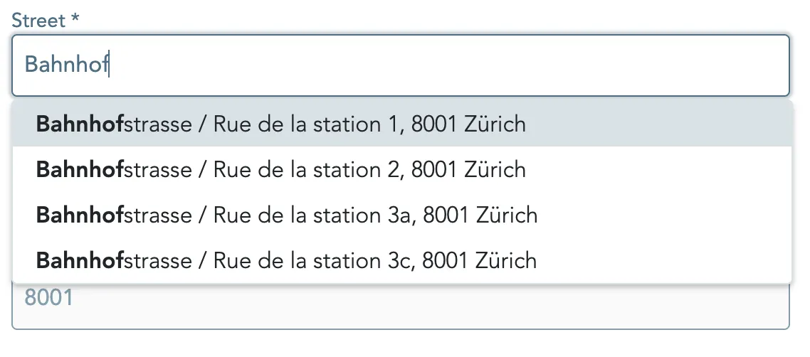
private readonly inputField = viewChild.required<ElementRef<HTMLInputElement>>('autocompleteInput');protected dropdownWidth = updateWidthOnElementResize(this.inputField);Looking at our autocomplete input field we can see that the dropdown now spans the full width of the input field and responds to input field resizes.
Benefits of this approach
- Efficiency: No unnecessary updates — only reacts to element resizes, not window resizes.
- Stability: No direct DOM manipulation, not relying on CSS class names to stay the same, reducing the risk of breaking changes.
- Simplicity: Minimal code, using well maintained native browser-API, reactivity out of the box and no manual change detection is required.
- Scalability: Supports multiple elements individually without interfering with each other.
Conclusion
In conclusion, the combination of ResizeObserver and Angular signals provides a powerful and efficient way to handle dynamic element size tracking in Angular applications.
It avoids the pitfalls of traditional window:resize event listeners and brings reactivity directly to the DOM elements that need it.
This small pattern can help with responsiveness and maintainability.
It is a great example of how modern web APIs can be effectively integrated into Angular applications to enhance performance and user experience. Let me know your thoughts in the comments below.
Bonus
You can easily extend the utility function to track both width and height if needed, or debounce the updates for extremely rapid layout changes. Or you might extract it to a directive for enhanced reusability.